
Silicon Labs
From Pogo-Sticking to Confident Navigation
Silicon Labs is a semiconductor and software company whose website serves as a primary channel for engineers, buyers, and developers evaluating products across IoT, wireless, and connectivity solutions. For a technically complex product catalog, the ability to find the right product quickly isn't a nice-to-have — it's the difference between a conversion and a lost customer.
UX Research & Design Led redesign of Silicon Labs' navigation architecture, validated by a 90% user preference rate in A/B testing — currently in development for production.
Role: UX Researcher, UX Designer (sole designer, project lead)
Tools: Figma
Timeline: Q4 2025
Status: In development
Problem:
Analytics told a clear story: over the past year, the site had seen a 9% YoY decrease in visitors and a 7% YoY increase in bounce rate. But the data that stood out most was the pattern of pogo-sticking — users repeatedly bouncing between mid-funnel pages without progressing toward a product or conversion.
This wasn't random drop-off. Users were landing on pages, hitting a dead end, backing out, and trying again. Something in the journey was actively working against them.
My Role:
I led this project end-to-end as the sole designer — from initial discovery and research through concept, testing, stakeholder presentation, and handoff to engineering.
Discovery:
Starting with the data
I began by mapping the end-to-end user flow from the homepage through the site's conversion-ready pages. What I found was that several above-the-fold CTAs were pulling users sideways — redirecting them away from natural progression in the buying journey rather than moving them forward.
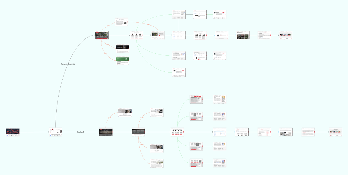
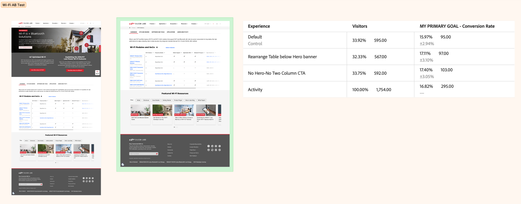
A/B Tests
To validate this, we ran an A/B test on the page most commonly disrupting the buying journey. Removing the distracting CTAs increased click-through rate by 1.43% — a small but meaningful signal that confirmed users were being pulled off course by competing calls to action.
But the data pointed to a deeper issue. The CTA problem was a symptom. The navigation itself was the root cause.
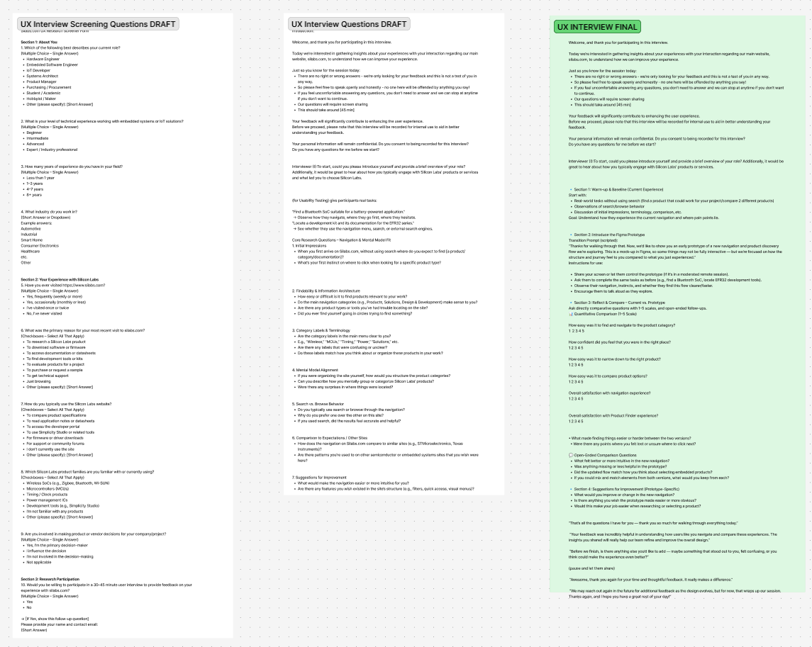
Listening to users
We conducted user interviews to understand what was actually happening from the user's perspective. What we heard was consistent: users struggled to orient themselves within the product catalog. The existing navigation didn't reflect how they thought about products — and finding something as fundamental as a hardware module required too many steps.
Two moments from the sessions stuck with me:
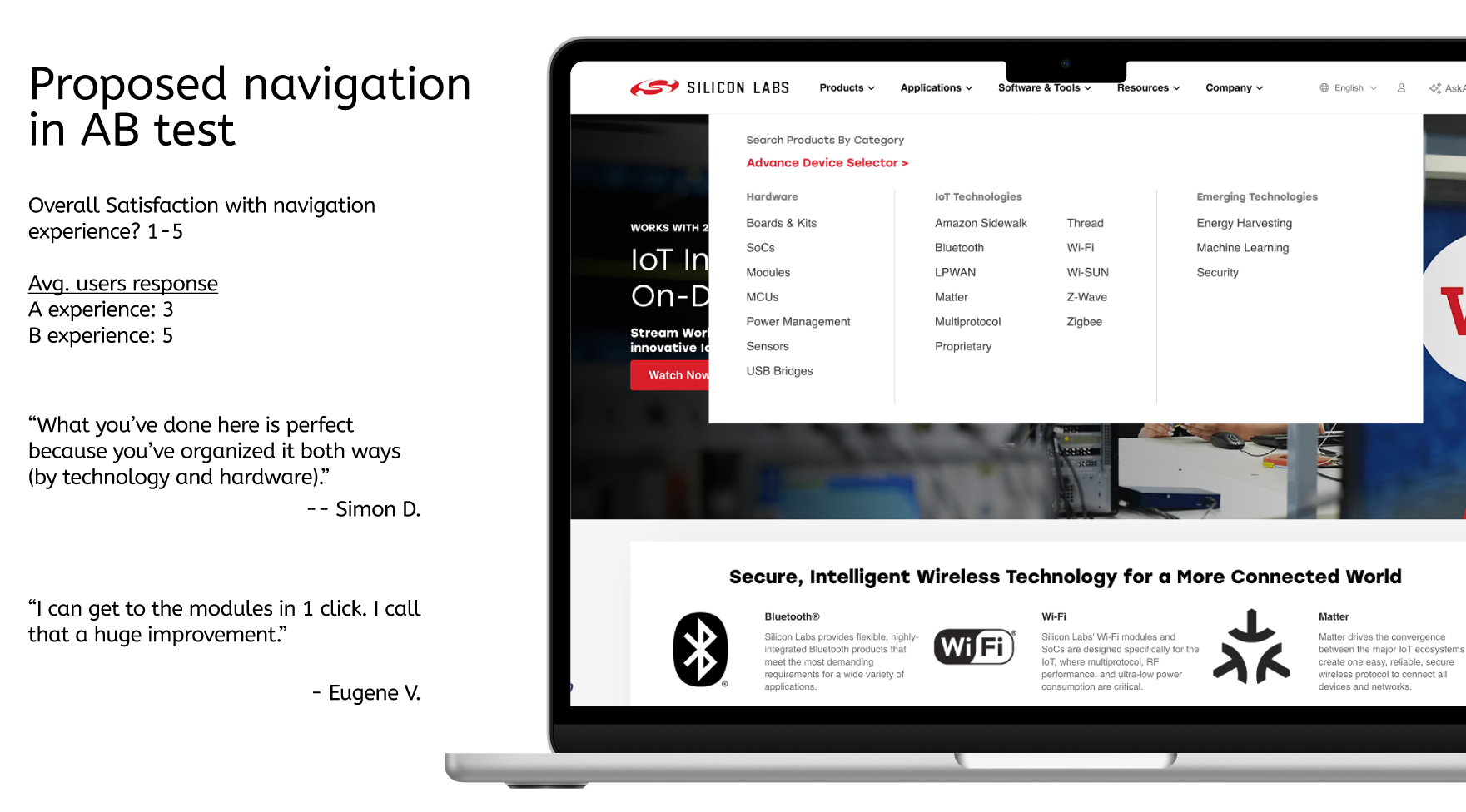
"What you've done here is perfect because you've organized it both ways — by technology and by hardware."
"I can get to the modules in 1 click. I call that a huge improvement."
Both quotes pointed to the same insight: users needed the navigation to match their mental model, not Silicon Labs' internal taxonomy. They think in terms of product type and technology category — and the navigation needed to support both paths simultaneously.
Framing the Problem:
With research complete, I defined the core design challenge as:
How might we restructure the navigation so users can find relevant products through their own mental model — whether they're starting from a technology or a hardware category — in as few steps as possible?
The Solution:
The redesigned navigation introduced a dual-organization system: products could now be browsed by technology (wireless, IoT, etc.) or by hardware (modules, SoCs, kits), giving users two valid entry points rather than forcing a single path.
The addition of a dedicated Hardware category was a key decision that came directly from the research. It didn't exist in the original navigation — users had to dig for it. Surfacing it at the top level removed a significant point of friction.
Key changes included:
Restructured top-level nav to surface both technology and hardware as parallel entry points
Reduced click depth to reach product modules from multiple steps to 1 click
Removed redundant or misdirecting CTAs from mid-funnel pages
Validation:
Before moving to development, I ran a preference-based A/B test on the redesigned navigation against the current experience.
90% of users preferred the new navigation.
Stakeholder response reinforced the direction. After presenting the findings and proposed solution, the team aligned quickly — the research made the case clearly enough that the path forward wasn't in question.
What’s Next:
The redesigned navigation is currently in development. Post-launch, the metrics to watch are bounce rate recovery, reduction in pogo-sticking on mid-funnel pages, and click-through rate on product pages.
What I'd Do Differently:
With more time, I would have pushed for a card sorting exercise earlier in the process — before the navigation concepts were formed — to more rigorously validate how users naturally group products. The interview insights were strong, but a structured card sort would have given us quantitative backing for the taxonomy decisions, not just preference data on the final designs.