TKMG Academy helps individuals and organizations build high-performing operations and develop their people through structured, self-paced learning. Their content is strong — but their platform was holding them back.
Role: Product Lead (sole designer)
Team: Front-End Developer, Back-End Developer
Tools: Figma
Type: Full End-to-End
Deliverables: Custom Learning Platform, Marketing Site
Product Design, End-to-End
Led product design of a custom e-learning platform from concept to launch — replacing a limiting third-party tool with a scalable, intuitive experience validated through beta user testing.
Context:
The business had been running on Litmos, an off-the-shelf LMS, and had reached a ceiling. As the platform's ambitions grew, Litmos was becoming increasingly difficult to bend to what TKMG actually needed, and their support experience with it was deteriorating. It was time to build something of their own.
The Problem:
TKMG needed a custom-built e-learning platform that could grow with the business — one that supported a subscription model, affiliate products, and personalized learning pathways for both individual learners and entire organizations.
But beyond the business requirements, there was a UX problem to solve. Existing e-learning platforms were leaving users overwhelmed. Learners wanted something that felt intuitive and guided — an experience that walked them through their courses rather than dropping them in and expecting them to figure it out.
The challenge was building something flexible enough to scale with TKMG's business, while simple enough that any user could pick it up without friction.
My Role:
I led this project as Product Lead, working directly with a front-end and back-end developer. That meant owning the full design process — research synthesis, flow mapping, wireframes, visual design, and dev collaboration through to launch — while also making product decisions around scope, prioritization, and feature trade-offs.
Discovery & Research:
Research surfaced a consistent theme: users found existing e-learning platforms too complicated and too generic. They weren't looking for a feature-rich tool — they wanted a guided, hand-holding experience that moved them through their learning naturally, without confusion or cognitive overload.
This became the north star for every design decision that followed: reduce friction, guide the user, and never make them wonder what to do next.
Process:
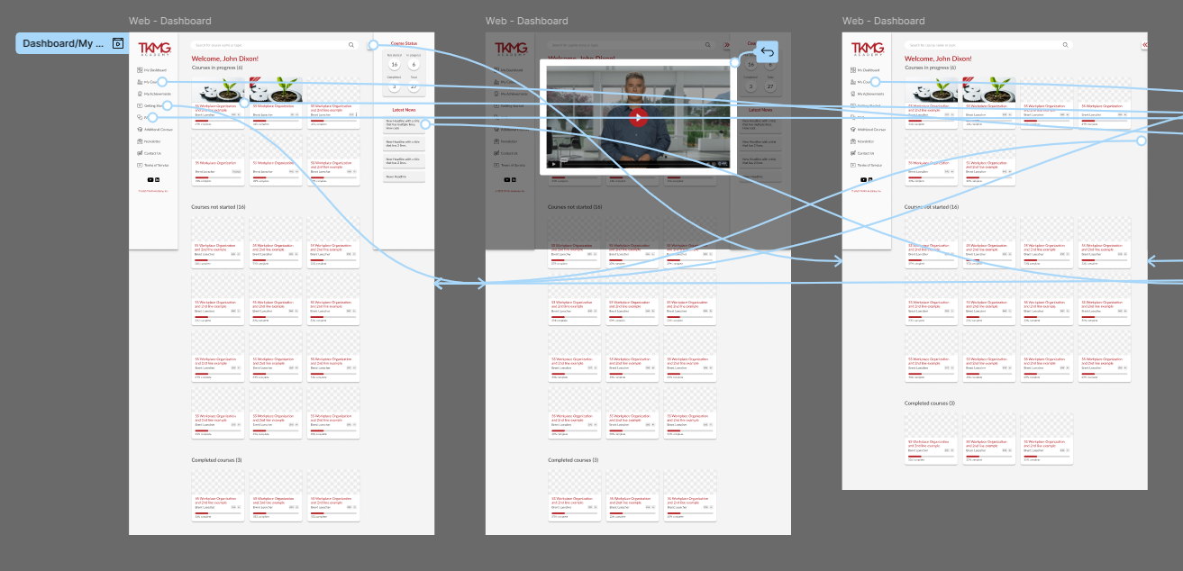
Flow Mapping
Before touching UI, I mapped the full user journey — from landing on the platform through purchasing, enrolling, and completing a course. The goal was to identify every point where a user might feel lost or have to make an unnecessary decision. Each step was designed to have one clear next action.
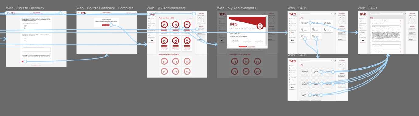
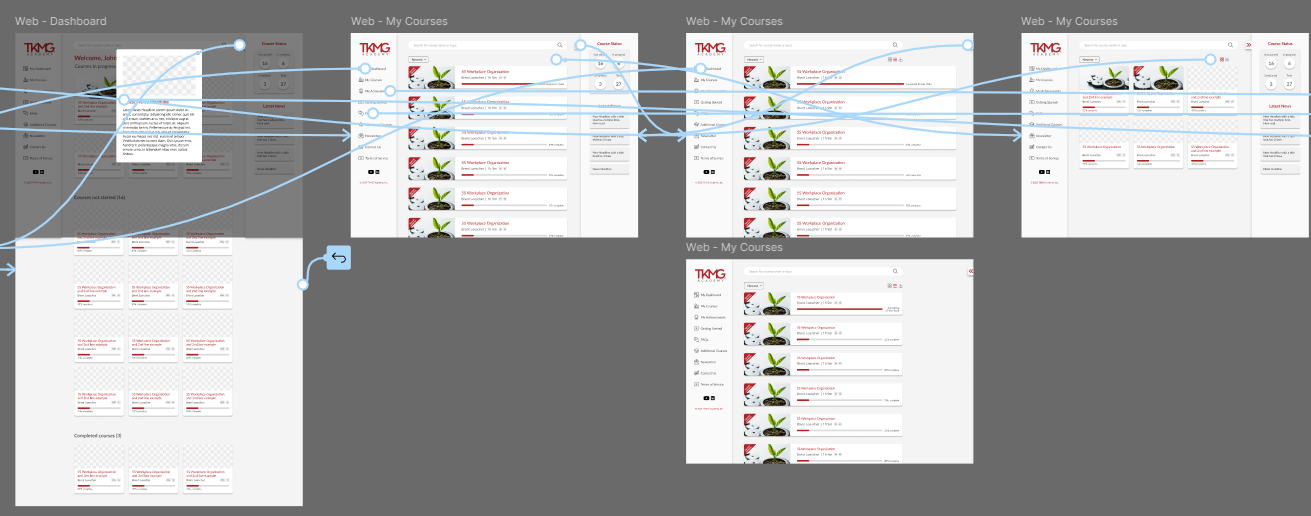
Wireframes & Early Testing
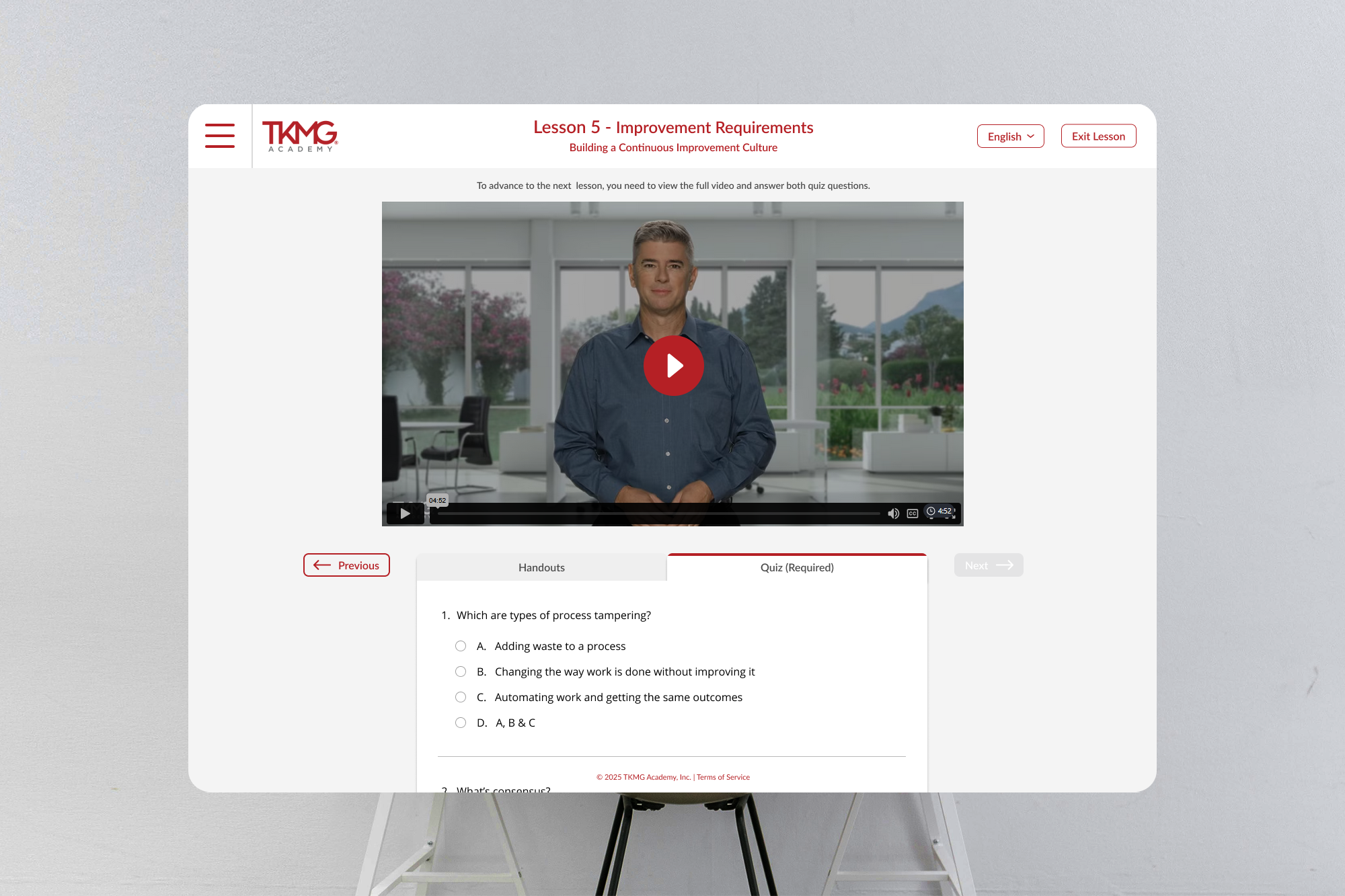
I built mid-fidelity wireframes to test the core flows early, before investing in visual design. This round of testing surfaced an important gap: users needed quick access to lesson handouts while they were watching a video — without losing their place or navigating away from the lesson.
This insight directly shaped the final information architecture.
Visual Design
With the structure validated, I explored visual directions that aligned with TKMG's existing brand — developing a design language that felt approachable and modern without departing from what their audience already associated with them.
The Solution:
The final platform centered on a clean, guided lesson experience built around how learners actually behave — not how platforms typically assume they do.
Key design decisions:
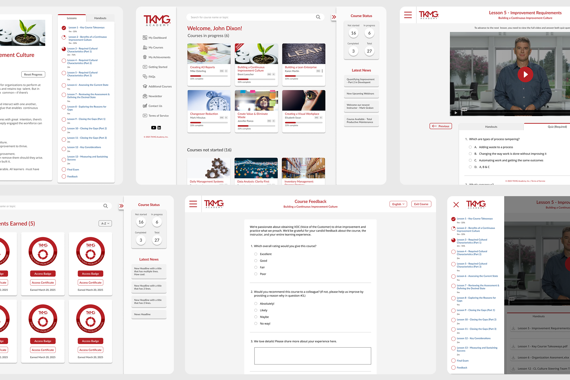
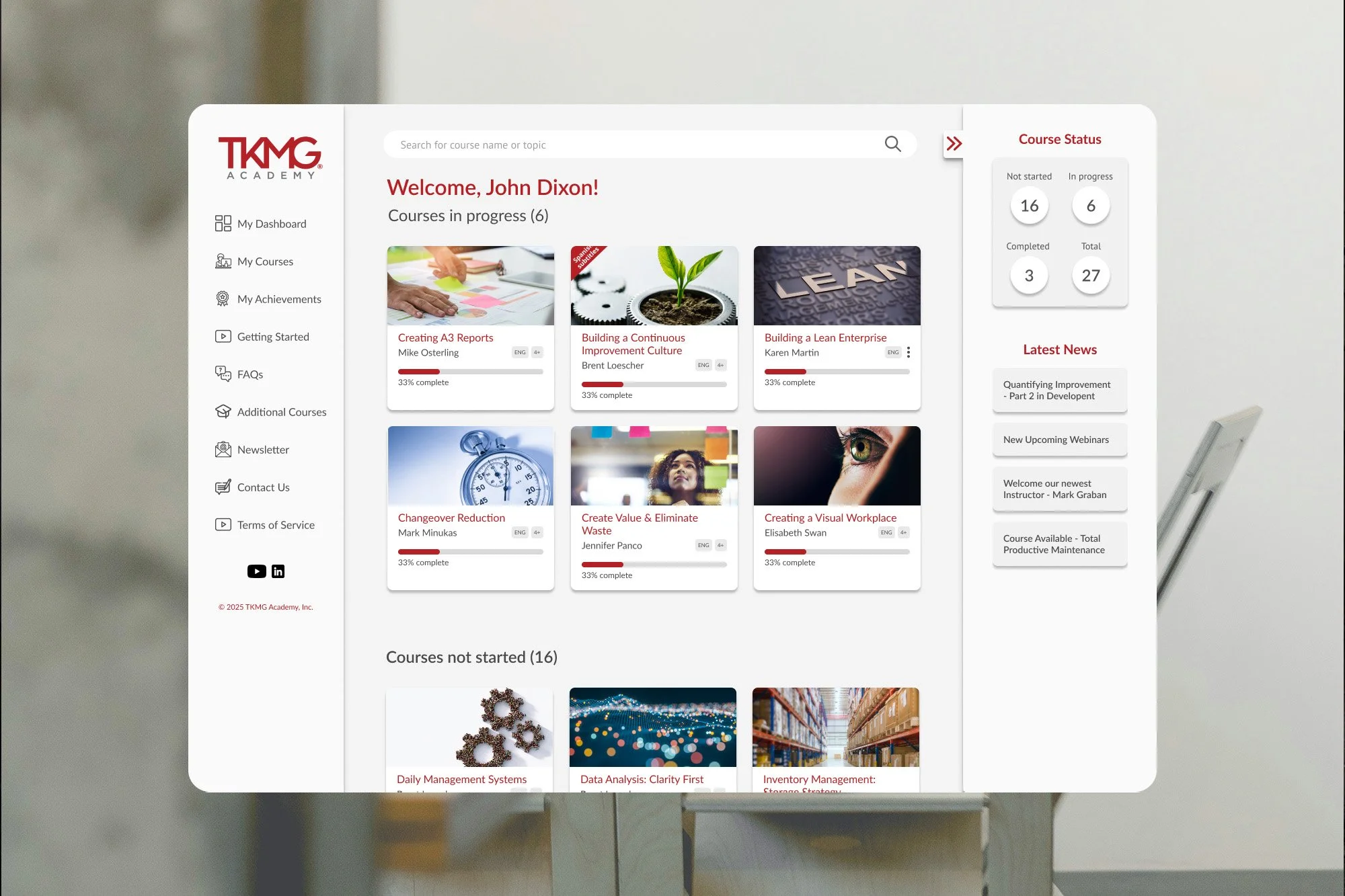
Centralized user dashboard — designed as the platform's home base, the dashboard gives users everything they need at a glance: the ability to continue where they left off, a quick overview of all course statuses, and the latest news and updates from TKMG — eliminating the need to navigate multiple screens just to get oriented
Clear, uncluttered course progression designed to eliminate the sense of being dropped into a complicated system — every interaction has one obvious next step
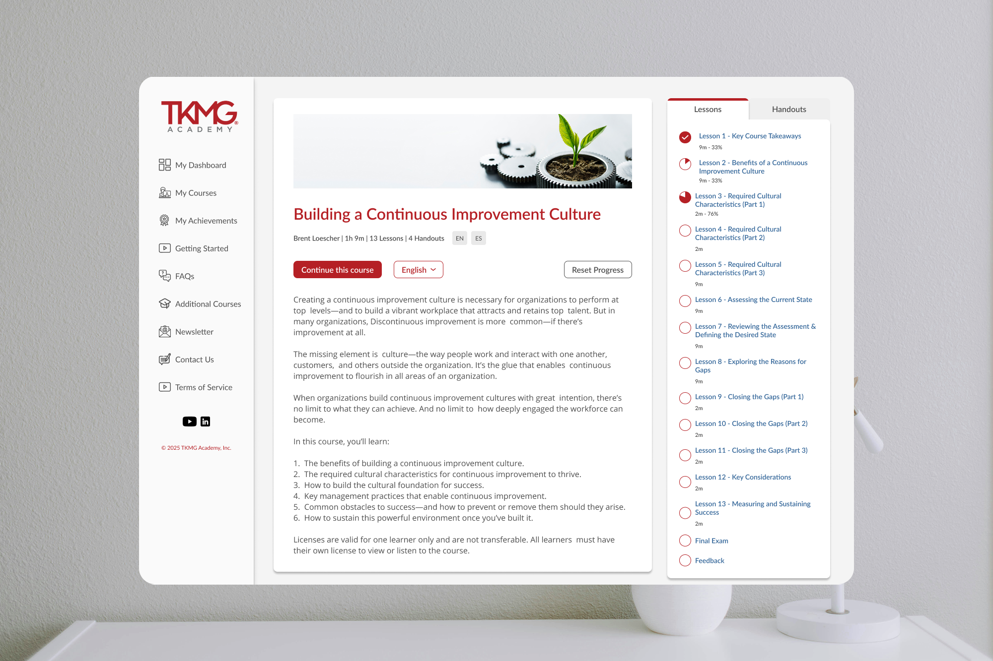
Right-hand rail with tabbed navigation on the course overview page, giving users quick access to both the lesson list and course handouts from a single persistent location — no hunting required
Handouts tab placed directly beneath the lesson video on the lesson page itself, responding to a natural user behavior: after finishing a video, the instinct is to scroll down. The handout is right there when they do
Lesson-specific handouts only — rather than surfacing all handouts at once (the previous approach), each lesson shows only the handout relevant to it, reducing overwhelm and keeping focus on the current step
Gamification through badges and certificates — users earn displayable badges as they complete courses and receive a certificate upon finishing, creating a sense of achievement that drives retention and friendly competition among learners
Validation:
Beta testing through VoC (Voice of Customer) sessions confirmed the approach was working. Users responded directly to the decisions that had been most deliberate:
"The lessons are easy to follow with the video."
"I appreciate that the handouts are underneath the video — scrolling down after the video is usually my next action."
"I like that it only shows the handout relevant to the lesson instead of all of them at the same time."
That last quote in particular validated one of the more opinionated calls made during design. Showing all handouts at once is the default behavior on most platforms — choosing to scope them to the current lesson was a deliberate UX decision, and users noticed.
What's Next:
TKMG Academy continues to evolve. Post-launch, I worked with the team to identify new areas of growth and design additional features to deepen engagement and expand the platform's capabilities over time.
What I'd Do Differently:
I'd push for more structured user research earlier — ideally running a few interviews before flow mapping began rather than relying on synthesized feedback. The wireframe testing caught the handout issue in time, but earlier qualitative research might have surfaced it sooner and revealed other friction points we didn't have the chance to explore.